If you are looking for website design grids you have come to the right place. In this post, we have discussed 5 different website design grids.
Grids are the design’s backbone; they assist you in establishing order and organizing the content of your design. We’ll discuss what a grid is, why you should use one in web design, and how to make one in this post.
You open your preferred design application and there it is, a blank canvas gazing back at you. It’s a touch daunting at times.
How do you begin? What position do you give the headline? Where do you place your artwork and photographs? A grid is all that is required to begin.
A grid is a structure used to organize the content of a design; it establishes alignment and order.
Whether you’re designing a layout for print, such as a magazine, or merging photos and text to create a landing page, a grid will assist you in making design choices and providing a positive user experience.
Consider how this landing page design utilizes a 12-column grid to organize its components. Using a grid removes the possibility of making random decisions.
Rather than randomly positioning pieces, by correctly using a grid, you’ll know precisely where to place elements like a logo, menu items, a headline, body content, and photographs. Additionally, it will aid in the acceleration of your design process.
In this article, I will be telling you all you need to know about how to use a grid in web design. So, stay with me to the end.
Why Are Grids Important in Web Design?
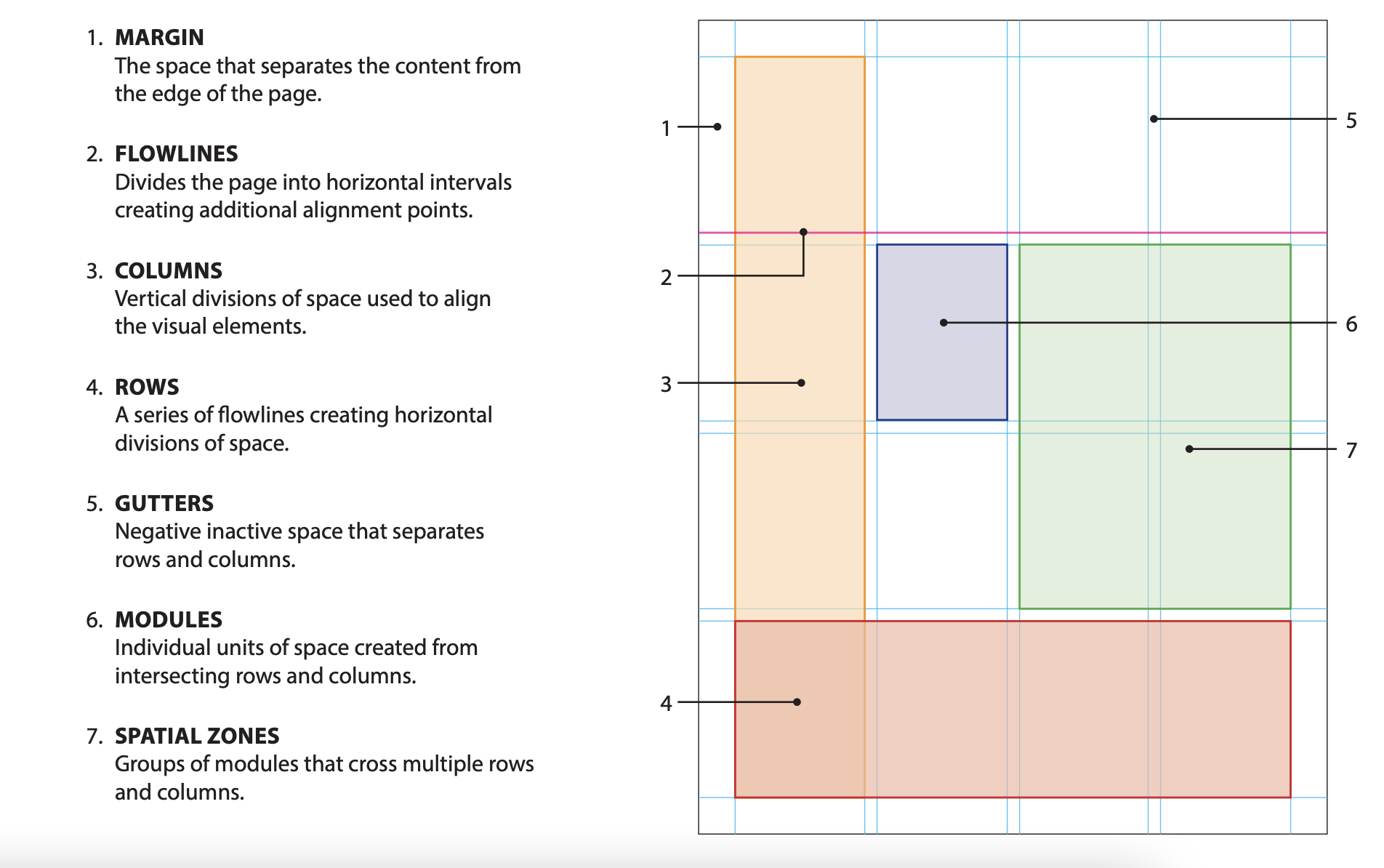
In terms of its application to the web design process, the grid system aids in the alignment of page components using successive columns and rows.
Once this hierarchical foundation is in place, we can arrange text, graphics, and practically any other design element inside the interface in a consistent, ordered fashion.
When designing for the web and mobile, the pages or interfaces we develop are intended to facilitate different user flows.
Grids facilitate the process of designing wireframes, templates, or standardized layouts for comparable sites since user flows often comprise several screens or windows that repeat similar design schemes and layouts.
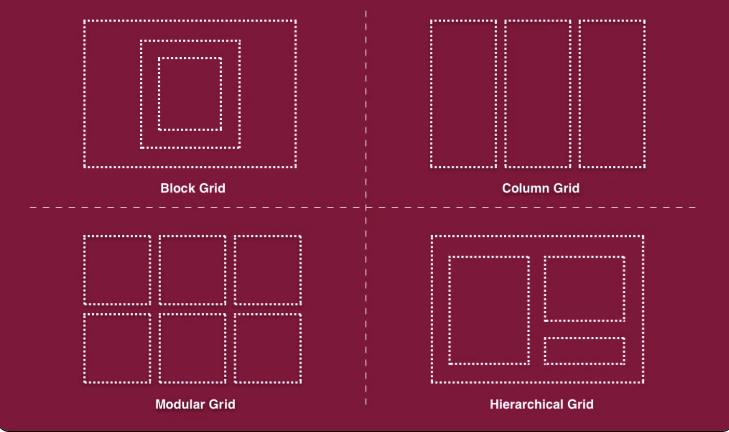
Grids enable the horizontal and vertical division of pages through rows and columns. Grid systems are a systematic technique that enables designers to arrange items in an orderly fashion and to develop components for several pages or layouts in a modular fashion.
Additionally, grids establish a standardized set of fixed units of measurement that determine the size, spacing, and alignment of each design element.
Grid layouts originated in print design when they were used in conjunction with typography to organize handwriting on paper, particularly in books and newspapers.
Having said that, many aspects of contemporary design rely on and thrive on grid-based layouts. This encompasses web design, interface design, and, most significantly, responsive design.
Before we dig into how and why grid-based layouts are such an invaluable tool to our design process as web developers, let’s take a closer look at the physical components that comprise a grid system.
4 Best Practices of Using Grids in Web Design
There are several words and ideas to get acquainted with and comprehend in the realm of web design, but none more so than the significance of grids in web design.
Between the several components that comprise a grid structure, the numerous grid types available, and the cognitive processes involved in determining which grid type best matches your content and design, there is a lot to take in.
1. Obey the Rule of Thirds:
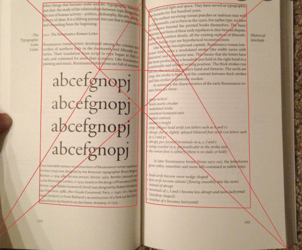
Another web design concept is the Rule of Thirds, which assists designers in creating aesthetically balanced grid layouts and picture placement.
This approach overlays a grid that divides the design area horizontally and vertically into thirds. This divides any picture or page section/space into nine equal segments defined by the intersections of the lines.
According to the Rule of Thirds, putting “objects of interest” on the “thirds” of a picture will direct the user’s attention to them in a more powerful, aesthetically appealing manner.
In web design, designers often use the Rule of Thirds to help them make some of the most critical grid and layout choices.
2. Respect the Golden Ratio:
Numerous designers use a concept known as the Golden Ratio to optimize the scale, balance, and layout of their grid designs. The Golden Ratio is a proportion that equals 1.6180 in its simplest form.
The golden rectangle is a rectangle whose length is 1.6180 times its width based on the Golden Ratio. This indicates that if the width of the element is 100px, the length will be 161.80px.
This is true for the breadth and length of adjacent pictures, objects, or forms, as well as the development of a single shape or element.
By using the Golden Ratio, designers may determine how to split the available horizontal space on the page and how much room to allow for and around each piece, among other things.
One instance in which this may occur is while developing a website’s hero section. If you choose a full-width layout and divide it vertically into two sections: the hero picture and the hero text.
Additionally, you’ll need to decide on the picture size, text size, and so on in this micro design procedure.
However, you must first decide on a column ratio, which will guide you in determining the size of your picture and typeface, as well as which elements you want to stress more or less, or if you want to lay equal focus on each.
This is when the decision of how to split the hero part in terms of which component should be bigger or more prominent comes into play. This is where the Golden Ratio is useful.
This guideline takes into account a variety of elements, including the page width, the content size, and the number and size of modules that the content will need on a grid.
In terms of accessibility, the Golden Ratio directs the user’s attention to certain points or locations on a screen, which is exactly what designers aim to do when they establish and implement their content and design scheme’s information hierarchy.
3. Make Room for White Space:
As web designers, we understand how critical white space is in terms of readability, information hierarchy, scalability, and general breathing room around and between design components.
Given white space’s vital role in layout design, it’s natural that website and layout grids use it.
Grid layouts are determined, in essence, not only by the width and height of their columns and rows but also by the width and height of the white space between them, referred to as spacing.
For instance, one grid-based design method that web designers often use is known as the 8pt Grid System, a notion established by Google’s Material Design guidelines.
The Material Design method makes use of an 8 by 8 pt grid. Each element on the website will be multiples of/divisible by eight in practice.
The fascinating thing is that this rule applies not just to grid items like photos, buttons, or text, but also to white space units, which must be multiples of eight.
Therefore, while considering how to space your columns or rows, you must also quantify and specify the quantity of white space, in this case in multiples of eight.
This demonstrates how critical white space is in grid design, to the point that its dimensions and requirements are just as critical as columns and rows.
The homepage of Elementor Experts exemplifies how powerful white space can be, particularly on a website’s homepage.
Because the homepage’s ultimate purpose is to compel viewers to act and learn about the Experts platform, white space supports this process by prioritizing information.
This implies that since the platform’s value proposition is given such prominence and “time to shine” on the homepage, website visitors immediately understand the increased value they are going to experience.
4. Honor Responsive Design:
Responsive design refers to the ability of a page or site’s layout and content to adjust to multiple devices and browser sizes. This implies that when the screen size varies, the number of columns and, of course, their width, will vary as well.
However, there is an intrinsic distinction between standard design grids and responsive grids.
While design grids are set to a baseline grid, responsive grids are flexible, allowing grid columns to resize and reposition themselves depending on the user’s viewport.
With a fixed grid, lowering the screen size will automatically bring you to the next breakpoint, and the side margins will also automatically decrease until the next breakpoint is reached.
A responsive grid, or fluid grid, is what you see when items change dynamically in response to the browser/screen shrinking. Responsive grids will logically align and organize your material logically.
This implies that when the viewport decreases, the tiles and grid content will also shrink proportionately.
Frequently Asked Questions: Website Design Grids 2024
👉 What is the best grid for web design?
Bootstrap is a slick, straightforward, and powerful mobile-first front-end framework that makes web development quicker and simpler. For us, this is the most popular choice. Frequently, twelve columns with indents. A standardized and straightforward method.
✅ What is a grid layout website?
The website grid is a technique for arranging and aligning the material on a page. It serves as the skeleton or fundamental framework of your user interface. Website grids help designers make design choices and produce a positive user experience.
👉 How do website grids work?
Grid systems are invisible frameworks used in web design that group all the components on a page together. The grid acts as a framework or armature around which a designer may arrange visual components (pictures, glyphs, paragraphs, etc.) in a logical, easily-absorbed fashion.
👀 How does a grid layout enhance web design?
Grids may significantly shorten and enhance your design time by acting as a guide for where to put, position, and scale objects. Rather than arbitrarily putting parts until you get a pleasing composition, a grid should assist you in finding a natural solution.
✅ Why do designers use grids?
Grids make it simpler for designers to collaborate on ideas by outlining where pieces should be placed. Grid systems aid in decoupling interface design work by allowing several designers to work on distinct components of the layout while remaining certain that their work will be smoothly integrated and consistent.
👉 How many columns should a grid have in web design?
Although there is no formal need for the number of columns, the majority of website grid architectures employ a 12-column grid. Additionally, a website grid contains regular space between columns, referred to as gutters, and spacing outside of the grid is referred to as margins.
💁 Why do we use a 12 column grid?
The majority of Bootstrap versions require just 12 columns to accommodate the following: Layout creation is simplified. Mobile-friendly layout. Proportional blocks to maintain symmetry.
✔️ What is the 12 column grid?
For websites, designers may use between two and twelve, or even sixteen columns to cover the breadth of a landing page. They may arrange text and graphics in a single column or across numerous columns.
👉 How do you use grid templates?
The grid-template-areas attribute defines the grid layout's areas. You may name grid items by referencing them in the grid-template-areas property through the grid-area property. Apostrophes denote each region. To refer to a grid object that does not have a name, use a period symbol.
Quick Links:
Conclusion: Website Design Grids 2024
Now that you understand why grids are critical in web design and how to use them on your website, it’s time to begin measuring and aligning.
Bear in mind that this principle applies to every design element: aligning widgets and components horizontally and vertically, aligning text elements to a baseline, and properly centering every sort of content on the website.
Your design process and the final product will be very appreciated, and we’re anxious to see what you have in store.