Adaptive Content Marketing: Driving Growth with Confidence
We assist well-known brands in achieving growth by crafting a flexible content marketing strategy that thrives in any financial climate and adapts to industry shifts.

We Believe In Empowering Growth at Every Stage of BUSINESS
We’re here to support your growth, whether you’re just starting out or scaling up.

-
Over 70 startups rely on us to navigate their early stages. We assist them in reaching product-market fit by implementing effective inbound strategies, generating consistent leads, and establishing a solid marketing infrastructure, all without needing an in-house team.
-
More than 30 scaleups trust us to enhance their marketing strategies. We help them optimize for efficient growth by fine-tuning campaigns and expanding ROI-focused acquisition efforts globally. Throughout the process, we collaborate closely with their internal marketing teams to ensure we meet their objectives.
We never said it was easy. We make it seem easy!
Boost Your Brand's Visibility with SEO
Did you know that almost half of all clicks on search results go to the very first position?
If your website is ranked low for the keywords relevant to your industry, you’re missing out on valuable leads.

Here's how SEO can help you:
→ Reduce Reliance on Paid Ads
Instead of relying solely on paid advertising, SEO helps you gain organic visibility, saving you money in the long run.
→ Enhance Credibility and Trust
By ranking high in search results, you establish your brand as credible and trustworthy in the eyes of your audience.
→ Drive High-Intent Traffic
SEO brings in visitors who are actively searching for products or services like yours, increasing the likelihood of conversions.
Experience a significant increase in Marketing Qualified Leads (MQLs) within 9-12 months.
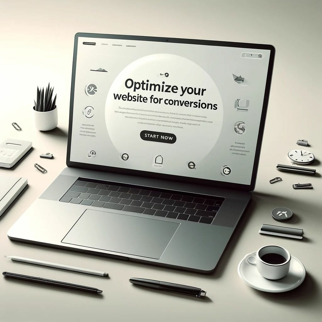
Optimize Your Website for Conversions
Did you know that B2B prospects spend only about 80 seconds on a webpage? Make every second count with a website optimized for conversions.
Here's how we can help:
→ Visually Stunning Websites
From Webflow to WordPress, we design visually appealing websites that capture leads effectively.
→ Double Your Conversions
With our expertise, transform your website into a lead-generating machine and double your conversion rates.
Digital Advertising for Targeted Leads
Digital advertising is a powerful tool to acquire qualified leads quickly. With precise targeting, you can reach your prospects where they spend their time online.

Here's what digital ads can do for you:
→ Accelerate Lead Generation
With targeted ads, you can reach potential customers faster and more efficiently than ever before.
→ Maximize ROI
With digital advertising, you can experience a remarkable return on investment (ROI) within 9-12 months.
→ Enhance Brand Awareness
Boost your brand’s visibility across multiple online platforms, making it recognizable to a broader audience and building trust over time.
Would we be a good fit for your content marketing needs?
40+ SaaS brands trust us to drive their organic growth

Immediate Results. And a Plan for Future Success.
Our Process Works for Both.
Discovery and Tailored Strategy:
We assess your current marketing efforts and competitors to find the best way forward. We collaborate with your team to offer tailored support.
OKR Setting and Execution:
With clear targets for the next 30-60-90 days, we get to work. We ensure consistency, ramp up operations, and prioritize learning from quick iterations.


Long-term Playbook and Roadmaps:
Using our expertise, we develop a comprehensive long-term strategy for your business. We guide you to invest wisely for predictable returns.
Reporting and Communication:
We keep you updated with weekly reports on progress and any challenges. You’ll have access to dashboards and reports showing your program’s performance accurately.

Choose how you work with Imagestation
Decide how you’d like to work with us based on your marketing budget, execution speed, and growth goals.

Done-For-You Monthly Retainer
From website audit, technical SEO, content strategy, and content creation to link building and content distribution; we’ll take care of everything. Get a consistent influx of qualified leads ready to translate into revenue.

Done-For-You Monthly Retainer
From website audit, technical SEO, content strategy, and content creation to link building and content distribution; we’ll take care of everything. Get a consistent influx of qualified leads ready to translate into revenue.

Done-For-You Monthly Retainer
From website audit, technical SEO, content strategy, and content creation to link building and content distribution; we’ll take care of everything. Get a consistent influx of qualified leads ready to translate into revenue.

Done-For-You Monthly Retainer
From website audit, technical SEO, content strategy, and content creation to link building and content distribution; we’ll take care of everything. Get a consistent influx of qualified leads ready to translate into revenue.
Our Booster Plan for Your Success
The ImageStation Boost plan is designed to accelerate your journey to success. Here’s what we do:
Competitor Analysis
We analyze your competitors and use advanced tools to find the best keywords to target.
On-Page SEO
We check your website thoroughly to see where it needs improvement and focus on areas that will make the biggest impact.
Engaging Content
Our team of skilled writers creates compelling content for your website and blog, tailored specifically for your audience.
Online Presence
We help you get more backlinks to your site, which boosts your website's authority and credibility in your industry.
Customer Success
We collaborate with you to develop a strategy, keep an eye on your progress, and provide regular updates so you're always in the loop.
SEO Audit
Get a brief yet comprehensive audit of your current SEO and content marketing performance.
Frequently asked questions
Yes, AffiliateBooster plugin is compatible with all WordPress themes.
Yes, AffiliateBooster plugin is compatible with all WordPress themes.
Yes, AffiliateBooster plugin is compatible with all WordPress themes.
Yes, AffiliateBooster plugin is compatible with all WordPress themes.
Yes, AffiliateBooster plugin is compatible with all WordPress themes.
Yes, AffiliateBooster plugin is compatible with all WordPress themes.
Yes, AffiliateBooster plugin is compatible with all WordPress themes.
Yes, AffiliateBooster plugin is compatible with all WordPress themes.
Get your free SaaS marketing plan
Let’s find out if we’re the SaaS content marketing company you’re looking for.

